The future feels retro in Cambridge
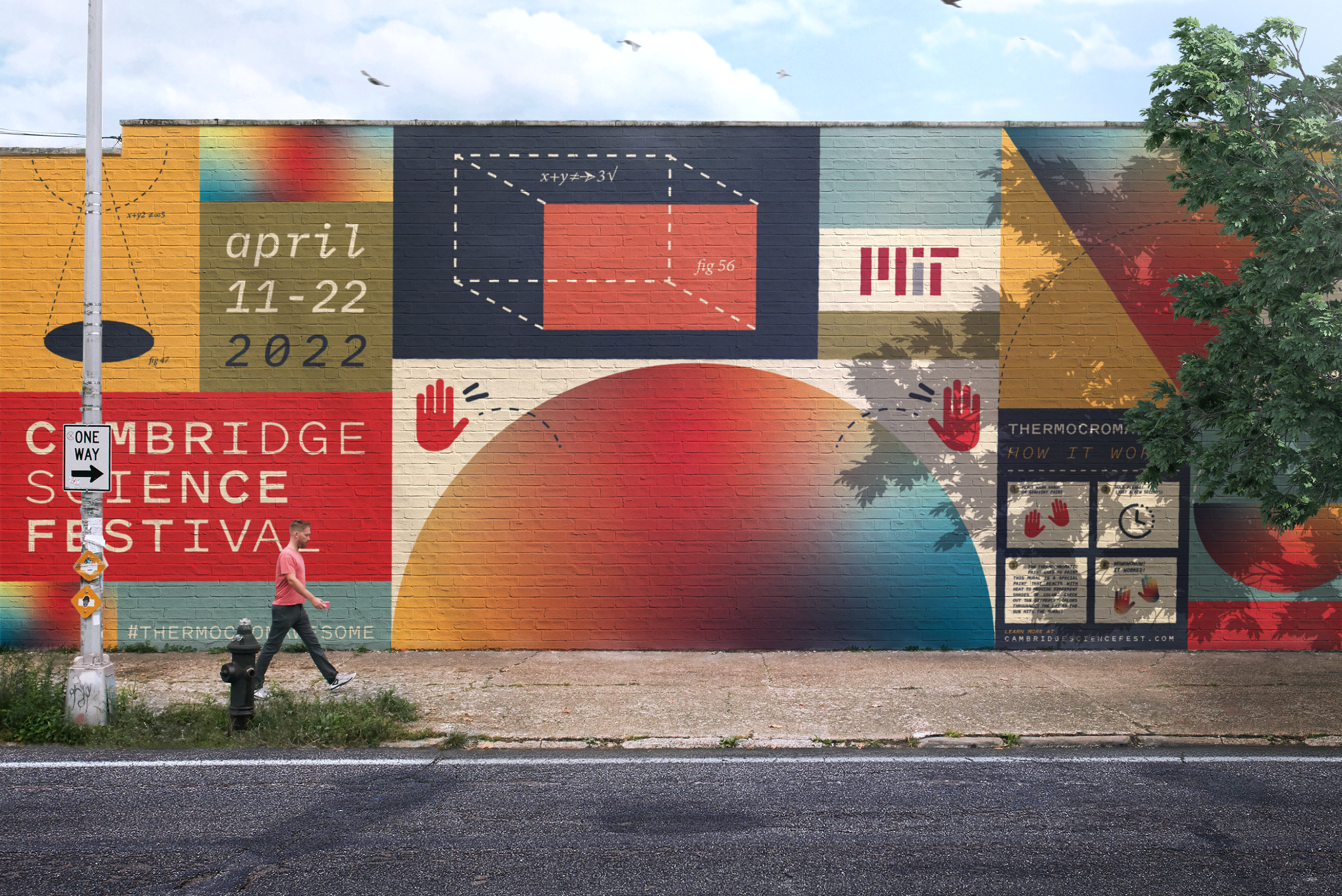
For inspiration, I started this project by looking at the surprisingly beautiful designs of 70’s geometry textbooks. I loved the simplicity of these flat diagrams, and I wanted to pair it with something vivid and modern so I chose this kaleidoscopic gradient to bring these into the current design realm and add movement.

With that, I chose to play with the weights of the logo type to really push that feeling of movement or vibration. I chose Klim’s Pitch typeface, as it has a very PRINTED feel to it, with a hint towards those inkwells. Paired with that is IBM Plex. Here in 2022, we’re at a place where a computer typeface can actually be considered retro, so this seemed like a perfect choice to bring together this relationship between new and old sciences.

I did some interesting research on Thermochromatic paint. Remember Hypercolor, the color changing t-shirts? Basically the same premise. This paint changes it’s color depending on it’s warmth. So when used in a mural, it will change as the sun hits it, causing an always shifting gradient effect.
…and will also offer some pretty sweet instagram moments. Because isn’t that what it’s all about?
