The Model Cafe embraces the chaos
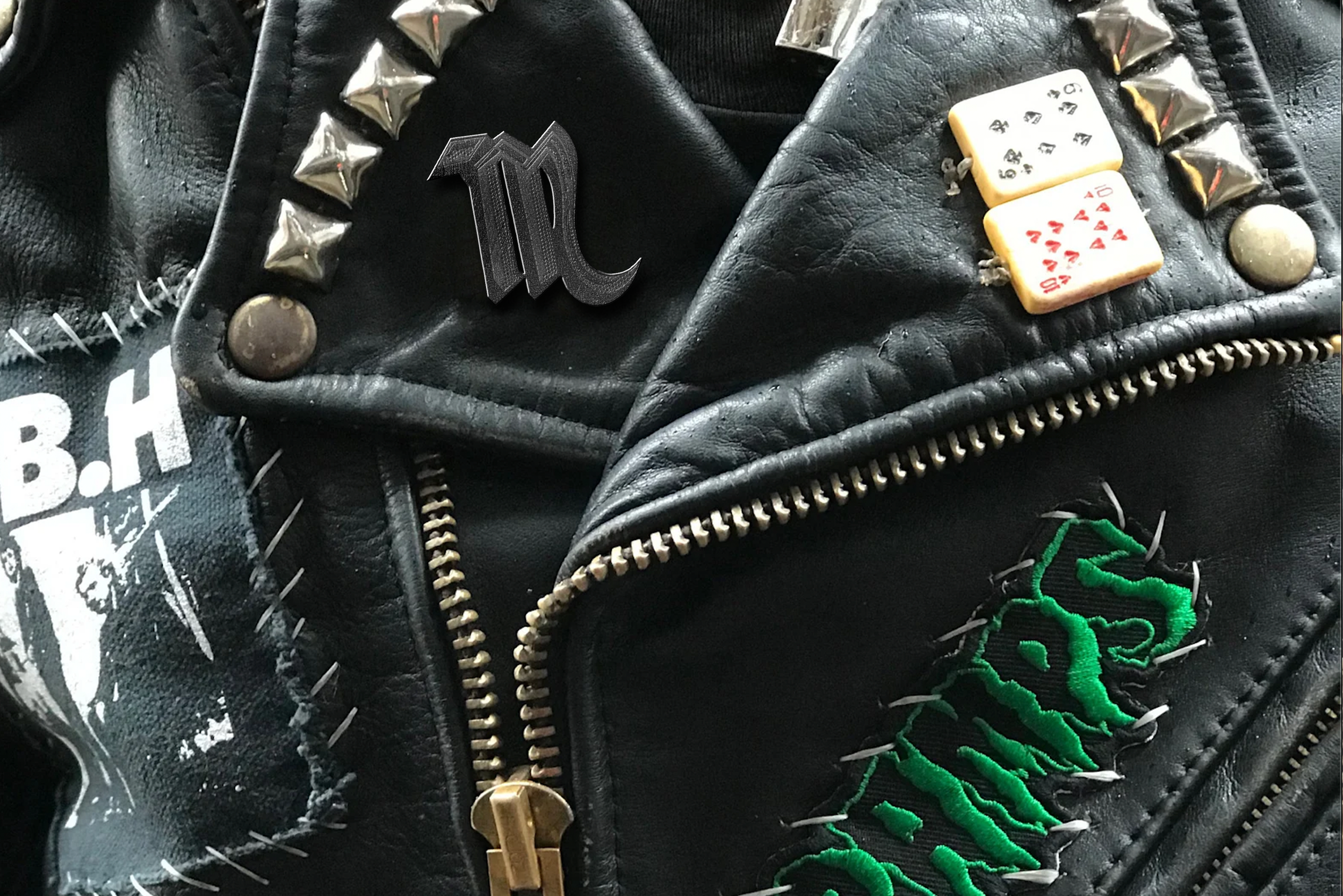
The Model Cafe, one of Boston’s longest standing bars (and one of the few dive bars left), has been homebase for the city’s misfits for the last few decades. As happens with true dives, there’s never been any real “branding”, other than the iconic neon sign that shines over Allston througout the wee hours of the night. Using the sign as a jumping off point, I drew out an “M” that acts an an homage to the history, as an icon that lives within the larger branding package.
Punk rock is dirty and loud, but it’s also very cheeky. One the elements I brought in, was the idea of these rock idols (Lemmy, Ozzy, Joan Jett etc) subtly wearing Model Cafe t-shirts–because why wouldn’t they be?

The main element I wanted to bring in was the chaotic feel of a bar. Like, the actual bar. Loose change, shitty bar food, stains, etc. A bar has grit, it’s physical. Ripped paper and polaroids, hand-drawn doodles. I want the viewer to FEEL the stickiness.
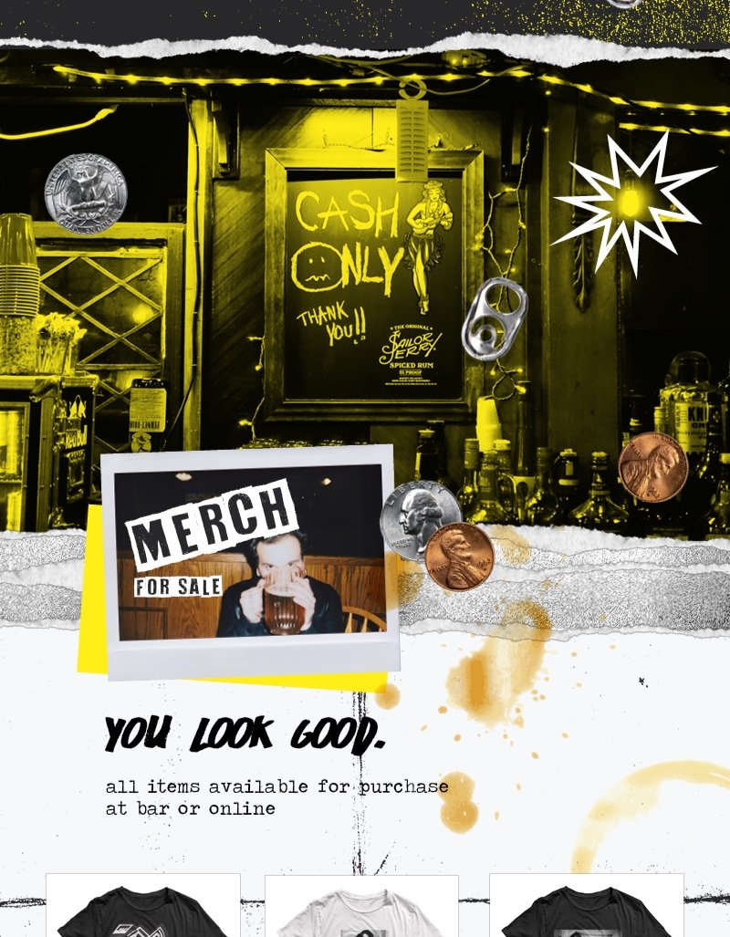
The color scheme is mainly black and white, influenced by the aesthetic of classic DIY flyers, the main art form in any counter culture music scene. I brought in the use of halftone and photocopy textures for that authentic gritty feel.

“What's this? You're wearing the shirt of the band you're going to see? Don't be that guy.” But what if you’re wearing the shirt of the band, who’s wearing the shirt of your bar? Is that meta?
